Ultra-thin geometric font family for minimalist branding
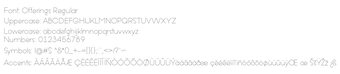
Offerings sets ultra-thin geometric sans-serif letterforms into Regular and Italic styles, creating a delicate monoline look for print and digital layouts. The typeface comes from Offerings' developer Situjuh Nazara of 7NTypes and targets designers who need restrained, modern typography. Key details include monoline circle-based construction, TrueType and OpenType delivery, and language coverage for more than 40 scripts. It suits branding, editorial headings, and invitation design where a light, airy display face is required.
What does Offerings change about typographic tone?
Offerings shifts headings and display text toward an ultra-light, geometric presence. Its construction uses smooth circular forms and a monoline stroke, which produces the delicate visual weight noted in the family. The face is intended for display use rather than body text because the ultra-thin weight reduces legibility at small sizes; designers should reserve it for titles, logos, and short lines where the slender forms remain readable.
How much control do designers get over pairing and emphasis?
The family supplies two coordinated styles for contrast, Offerings Regular and Offerings Italic, enabling straightforward emphasis without introducing mismatched weights. The italic preserves the geometric motif while providing slanted forms for hierarchy. Because the package ships only two styles, designers must pair the font with a companion typeface when they need a broader weight range or stronger text-level differentiation.
Does Offerings affect system performance or file compatibility?
Offerings uses standard font formats that integrate with common desktop apps. It is available as TrueType and OpenType files, so it installs in the system font folder and works in office suites and creative tools that accept .ttf or .otf. The files themselves do not run background processes and have no measurable effect on system performance; they behave like other static font resources when embedded or activated.
Is the font simple to install and use across displays and languages?
Installation follows the normal Windows font workflow and supports many languages. After extracting the archive, users right-click the .ttf or .otf and select Install to make the family available system-wide. Language support covers 47+ languages, including English, Spanish, French, and Portuguese, and the character set includes Latin, Latin-1 Supplement, and Latin Extended-A blocks for broad typographic coverage.
Who should choose Offerings and what to watch for
Offerings fits designers who want a slender, geometric display face for logos, editorial headings, and invitations, because its monoline circular forms deliver a refined, airy look. Note that the family supplies only Regular and Italic, so projects requiring multiple weights need a secondary typeface. Also confirm commercial licensing terms before embedding the font in client work.